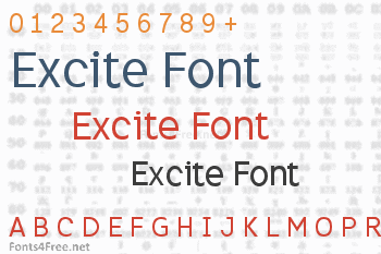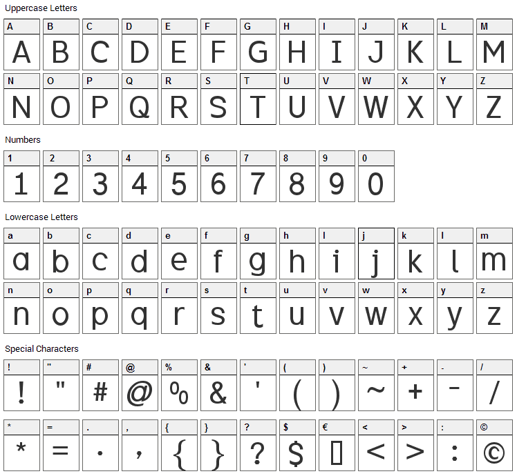

Excite is a neo-grotesque typeface named after an x-height that's as tall as you can get without compromising the distinction between upper and lower case, helping to make it extremely readable both in print and on screen. It is modern and spacious, has short ascenders and descenders, and an airiness augmented by using both horizontal and vertical endings of open characters like C, S and 3. Unusually for a neo-grotesque, Excite has a clean, contemporary, single storey lowercase A. Other distinctive features include a hexagonal dot/period, and the dog-leg tail of the Q. To avoid confusion between similar characters, Excite uses features like horizontal bars on the capital i and a curved tail on the lowercase L. The Excite family consists of four fonts: regular, bold, italic and bold italic.

Excite font contains 275 defined characters and 265 unique glyphs.
The font contains characters from the following unicode character ranges: Basic Latin (93), Latin-1 Supplement (94), Latin Extended-A (37), Latin Extended-B (1), Spacing Modifier Letters (9), Greek and Coptic (4), General Punctuation (16), Currency Symbols (1), Letterlike Symbols (2), Mathematical Operators (13), Geometric Shapes (1), Private Use Area (1), Alphabetic Presentation Forms (2).
- Font Name:Excite
- Subfamily:Regular
- Version:Fontographer 4.7 15/5/09 FG4M0000002045
- Manufacturer:Keith Bates, K-Type
- Designer:Keith Bates, K-Type
Submit a comment, question or review about Excite font


I love the tiny details - especially the hexagonal shape wherever there's a dot use.. including the question mark. I'm thinking of trying this out at home. (I'm not sure how useful the % sign is without a line across the middle!)
I'm glad to find this - I am doing some font research for an author's 2nd book. I'm not sure this fits the 70s vibe but it is good to keep in mind for other things. thank you