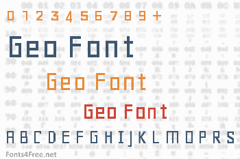

I was shown squared-off lettering on a record label and asked to draw something similar. Geo, the result, was substantially completed within four hours in July 1999. It’s a simple geometric typeface in the mould of some of the experimental faces designed during the 1920s by well-known modernist designers such as Theo van Doesberg and Herbert Bayer.
This style found a strong echo in designs of Neville Brody in the 1980s, which are now identified as an expression of the consumer culture of that decade. During the 1990s the magazine and font catalogue Emigre was at the public front of typeface design, and was a place where computer fonts with this same look appeared.
I think Geo expresses both the directness of some of the 1920s faces and the rather disingenuous consumerist thrust of the 1980s and 1990s descendants of theirs.
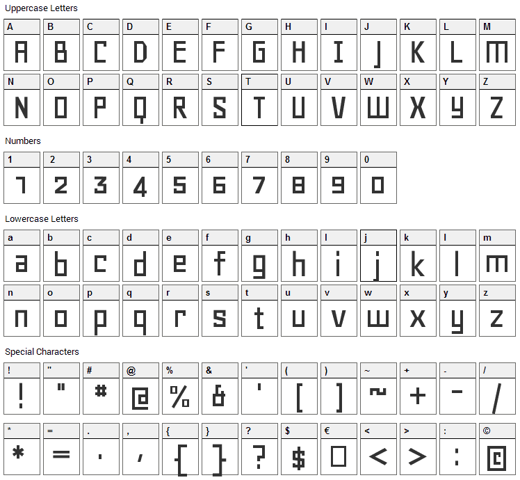
Geo font contains 203 defined characters and 155 unique glyphs.
The font contains characters from the following unicode character ranges: Basic Latin (93), Latin-1 Supplement (77), Latin Extended-A (8), Latin Extended-B (1), Spacing Modifier Letters (3), General Punctuation (12), Letterlike Symbols (1), Mathematical Operators (5), Alphabetic Presentation Forms (2).
- Font Name:Geo
- Subfamily:Regular
- Version:Version 001.2
- License:Copyright (c) 2000-2010, Ben Weiner (ben@readingtype.org.uk), with Reserved Font Name Geo. This Font Software is licensed under the SIL Open Font License, Version 1.1. This license is copied below, and is also available with a FAQ at: http://scripts.sil.org/OFL ----------------------------------------------------------- SIL OPEN FONT LICENSE Version 1.1 - 26 February 2007 ----------------------------------------------------------- PREAMBLE The goals of the Open Font License (OFL) are to stimulate worldwide development of collaborative font projects, to support the font creation efforts of academic and linguistic communities, and to provide a free and open framework in which fonts may be shared and improved in partnership with others. The OFL allows the licensed fonts to be used, studied, modified and redistributed freely as long as they are not sold by themselves. The fonts, including any derivative works, can be bundled, embedded, redistributed and/or sold with any software provided that any reserved names are not used by derivative works. The fonts and derivatives, however, cannot be released under any other type of license. The requirement for fonts to remain under this license does not apply to any document created using the fonts or their derivatives. DEFINITIONS "Font Software" refers to the set of files released by the Copyright Holder(s) under this license and clearly marked as such. This may include source files, build scripts and documentation. "Reserved Font Name" refers to any names specified as such after the copyright statement(s). "Original Version" refers to the collection of Font Software components as distributed by the Copyright Holder(s). "Modified Version" refers to any derivative made by adding to, deleting, or substituting -- in part or in whole -- any of the components of the Original Version, by changing formats or by porting the Font Software to a new environment. "Author" refers to any designer, engineer, programmer, technical writer or other person who contributed to the Font Software. PERMISSION & CONDITIONS Permission is hereby granted, free of charge, to any person obtaining a copy of the Font Software, to use, study, copy, merge, embed, modify, redistribute, and sell modified and unmodified copies of the Font Software, subject to the following conditions: 1) Neither the Font Software nor any of its individual components, in Original or Modified Versions, may be sold by itself. 2) Original or Modified Versions of the Font Software may be bundled, redistributed and/or sold with any software, provided that each copy contains the above copyright notice and this license. These can be included either as stand-alone text files, human-readable headers or in the appropriate machine-readable metadata fields within text or binary files as long as those fields can be easily viewed by the user. 3) No Modified Version of the Font Software may use the Reserved Font Name(s) unless explicit written permission is granted by the corresponding Copyright Holder. This restriction only applies to the primary font name as presented to the users. 4) The name(s) of the Copyright Holder(s) or the Author(s) of the Font Software shall not be used to promote, endorse or advertise any Modified Version, except to acknowledge the contribution(s) of the Copyright Holder(s) and the Author(s) or with their explicit written permission. 5) The Font Software, modified or unmodified, in part or in whole, must be distributed entirely under this license, and must not be distributed under any other license. The requirement for fonts to remain under this license does not apply to any document created using the Font Software. TERMINATION This license becomes null and void if any of the above conditions are not met. DISCLAIMER THE FONT SOFTWARE IS PROVIDED "AS IS", WITHOUT WARRANTY OF ANY KIND, EXPRESS OR IMPLIED, INCLUDING BUT NOT LIMITED TO ANY WARRANTIES OF MERCHANTABILITY, FITNESS FOR A PARTICULAR PURPOSE AND NONINFRINGEMENT OF COPYRIGHT, PATENT, TRADEMARK, OR OTHER RIGHT. IN NO EVENT SHALL THE COPYRIGHT HOLDER BE LIABLE FOR ANY CLAIM, DAMAGES OR OTHER LIABILITY, INCLUDING ANY GENERAL, SPECIAL, INDIRECT, INCIDENTAL, OR CONSEQUENTIAL DAMAGES, WHETHER IN AN ACTION OF CONTRACT, TORT OR OTHERWISE, ARISING FROM, OUT OF THE USE OR INABILITY TO USE THE FONT SOFTWARE OR FROM OTHER DEALINGS IN THE FONT SOFTWARE.
- License URL:http://scripts.sil.org/OFL
Submit a comment, question or review about Geo font
No comments yet. Be the first to comment.