
Berlin email - no, not email, but email. A typeface inspired by Email signs of the 1930 bi $ 1950. Enamel signs emerged so at the beginning of 1890 were $ e $ pure scripture signs and they were labeled in 2 or 3 colors with some $ different lettering. The first weather-resistant duration posters were done so in 1910. It was discovered that $ weatherproof metal signs advertising it more benefit with al $ posters that were $ advertizing pregnant only a short time due to de $ changeable weather. But door numbers for Hau $, $ NOTE By tablets, shield on mailbox Item subjects in mom-and-pop shops, street signs - everywhere were now used labeled Enamel signs. Except for street signs no standardized writings were taken, everyone could fit down his shield for the desired font. So it seems the manufacturer of the Berlin Tin Signs to have been a smart $ fellows, for there $ quirky little c is also the basic template for that $ small e. Since I found this font only to Berlin enamel signs and wall labels in the Berlin bunker, I call this font Berlin Email. I have this script comes with two different small $, the long and round Schlus $ - $. Rules according Leipzig fracture. The signs I found different versions. Therefore, I also added two different ß as $ second is on the pound sign (#). Have fun painting signs...
* German to English Translation provided by Google Translate
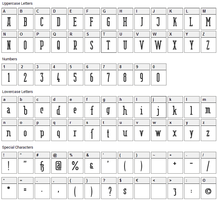
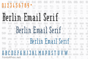
Berlin Email Serif font contains 209 defined characters and 200 unique glyphs.
The font contains characters from the following unicode character ranges: Basic Latin (90), Latin-1 Supplement (91), Latin Extended-A (7), Latin Extended-B (1), Spacing Modifier Letters (2), General Punctuation (15), Currency Symbols (1), Letterlike Symbols (1).
- Font Name:Berlin Email Serif Semibold
- Subfamily:Regular
- Version:Version 000.000
- Trademark:Berlin Email is a trademark of Peter Wiegel, CAT Webdesign, Wolgast.
- Manufacturer:Peter Wiegel, CAT Webdesign, Wolgast
- Designer:Peter Wiegel
- Designer URL:http://www.peter-wiegel.de
- License:DER GEGENSTAND DIESER LIZENZ (WIE UNTER "SCHUTZGEGENSTAND" DEFINIERT) WIRD UNTER DEN BEDINGUNGEN DIESER CREATIVE COMMONS PUBLIC LICENSE ("CCPL", "LIZENZ" ODER "LIZENZVERTRAG") ZUR VERFÜGUNG GESTELLT. DER SCHUTZGEGENSTAND IST DURCH DAS URHEBERRECHT UND/ODER ANDERE GESETZE GESCHÜTZT. JEDE FORM DER NUTZUNG DES SCHUTZGEGENSTANDES, DIE NICHT AUFGRUND DIESER LIZENZ ODER DURCH GESETZE GESTATTET IST, IST UNZULÄSSIG. DURCH DIE AUSÜBUNG EINES DURCH DIESE LIZENZ GEWÄHRTEN RECHTS AN DEM SCHUTZGEGENSTAND ERKLÄREN SIE SICH MIT DEN LIZENZBEDINGUNGEN RECHTSVERBINDLICH EINVERSTANDEN. SOWEIT DIESE LIZENZ ALS LIZENZVERTRAG ANZUSEHEN IST, GEWÄHRT IHNEN DER LIZENZGEBER DIE IN DER LIZENZ GENANNTEN RECHTE UNENTGELTLICH UND IM AUSTAUSCH DAFÜR, DASS SIE DAS GEBUNDENSEIN AN DIE LIZENZBEDINGUNGEN AKZEPTIEREN. 1. Definitionen 1. Der Begriff "Abwandlung" im Sinne dieser Lizenz bezeichnet das Ergebnis jeglicher Art von Veränderung des Schutzgegenstandes, solange die eigenpersönlichen Züge des Schutzgegenstandes darin nicht verblassen und daran eigene Schutzrechte entstehen. Das kann insbesondere eine Bearbeitung, Umgestaltung, Änderung, Anpassung, Übersetzung oder Heranziehung des Schutzgegenstandes zur Vertonung von Laufbildern sein. Nicht als Abwandlung des Schutzgegenstandes gelten seine Aufnahme in eine Sammlung oder ein Sammelwerk und die freie Benutzung des Schutzgegenstandes. 2. Der Begriff "Sammelwerk" im Sinne dieser Lizenz meint eine Zusammenstellung von literarischen, künstlerischen oder wissenschaftlichen Inhalten, sofern diese Zusammenstellung aufgrund von Auswahl und Anordnung der darin enthaltenen selbständigen Elemente eine geistige Schöpfung darstellt, unabhängig davon, ob die Elemente systematisch oder methodisch angelegt und dadurch einzeln zugänglich sind oder nicht. 3. "Verbreiten" im Sinne dieser Lizenz bedeutet, den Schutzgegenstand oder Abwandlungen im Original oder in Form von Vervielfältigungsstücken, mithin in körperlich fixierter Form der Öffentlichkeit anzubieten oder in Verkehr zu bringen. 4. Unter "Lizenzelementen" werden im Sinne dieser Lizenz die folgenden übergeordneten Lizenzcharakteristika verstanden, die vom Lizenzgeber ausgewählt wurden und in der Bezeichnung der Lizenz zum Ausdruck kommen: "Namensnennung", "Weitergabe unter gleichen Bedingungen". 5. Der "Lizenzgeber" im Sinne dieser Lizenz ist diejenige natürliche oder juristische Person oder Gruppe, die den Schutzgegenstand unter den Bedingungen dieser Lizenz anbietet und insoweit als Rechteinhaberin auftritt. 6. "Rechteinhaber" im Sinne dieser Lizenz ist der Urheber des Schutzgegenstandes oder jede andere natürliche oder juristische Person oder Gruppe von Personen, die am Schutzgegenstand ein Immaterialgüterrecht erlangt hat, welches die in Abschnitt 3 genannten Handlungen erfasst und bei dem eine Einräumung von Nutzungsrechten oder eine Weiterübertragung an Dritte möglich ist. 7. Der Begriff "Schutzgegenstand" bezeichnet in dieser Lizenz den literarischen, künstlerischen oder wissenschaftlichen Inhalt, der unter den Bedingungen dieser Lizenz angeboten wird. Das kann insbesondere eine persönliche geistige Schöpfung jeglicher Art, ein Werk der kleinen Münze, ein nachgelassenes Werk oder auch ein Lichtbild oder anderes Objekt eines verwandten Schutzrechts sein, unabhängig von der Art seiner Fixierung und unabhängig davon, auf welche Weise jeweils eine Wahrnehmung erfolgen kann, gleichviel ob in analoger oder digitaler Form. Soweit Datenbanken oder Zusammenstellungen von Daten einen immaterialgüterrechtlichen Schutz eigener Art genießen, unterfallen auch sie dem Begriff "Schutzgegenstand" im Sinne dieser Lizenz. 8. Mit "Sie" bzw. "Ihnen" ist die natürliche oder juristische Person gemeint, die in dieser Lizenz im Abschnitt 3 genannte Nutzungen des Schutzgegenstandes vornimmt und zuvor in Hinblick auf den Schutzgegenstand nicht gegen Bedingungen dieser Lizenz verstoßen oder aber die ausdrückliche Erlaubnis des Lizenzgebers erhalten hat, die durch diese Lizenz gewährten Nutzungsrechte trotz eines vorherigen Verstoßes auszuüben. 9. Unter "Öffentlich Zeigen" im Sinne dieser Lizenz sind Veröffentlichungen und Präsentationen des Schutzgegenstandes zu verstehen, die für eine Mehrzahl von Mitgliedern der Öffentlichkeit bestimmt sind und in unkörperlicher Form mittels öffentlicher Wiedergabe in Form von Vortrag, Aufführung, Vorführung, Darbietung, Sendung, Weitersendung, zeit- und ortsunabhängiger Zugänglichmachung oder in körperlicher Form mittels Ausstellung erfolgen, unabhängig von bestimmten Veranstaltungen und unabhängig von den zum Einsatz kommenden Techniken und Verfahren, einschließlich drahtgebundener oder drahtloser Mittel und Einstellen in das Internet. 10. "Vervielfältigen" im Sinne dieser Lizenz bedeutet, mittels beliebiger Verfahren Vervielfältigungsstücke des Schutzgegenstandes herzustellen, insbesondere durch Ton- oder Bildaufzeichnungen, und umfasst auch den Vorgang, erstmals körperliche Fixierungen des Schutzgegenstandes sowie Vervielfältigungsstücke dieser Fixierungen anzufertigen, sowie die Übertragung des Schutzgegenstandes auf einen Bild- oder Tonträger oder auf ein anderes elektronisches Medium, gleichviel ob in digitaler oder analoger Form. 11. "Mit Creative Commons kompatible Lizenz" bezeichnet eine Lizenz, die unter http://creativecommons.org/compatiblelicenses aufgelistet ist und die durch Creative Commons als grundsätzlich zur vorliegenden Lizenz äquivalent akzeptiert wurde, da zumindest folgende Voraussetzungen erfüllt sind: Diese mit Creative Commons kompatible Lizenz 1. enthält Bestimmungen, welche die gleichen Ziele verfolgen, die gleiche Bedeutung haben und die gleichen Wirkungen erzeugen wie die Lizenzelemente der vorliegenden Lizenz; und 2. erlaubt ausdrücklich das Lizenzieren von ihr unterstellten Abwandlungen unter vorliegender Lizenz, unter einer anderen rechtsordnungsspezifisch angepassten Creative-Commons-Lizenz mit denselben Lizenzelementen, wie sie die vorliegende Lizenz aufweist, oder unter der entsprechenden Creative-Commons-Unported-Lizenz. 2. Schranken des Immaterialgüterrechts Diese Lizenz ist in keiner Weise darauf gerichtet, Befugnisse zur Nutzung des Schutzgegenstandes zu vermindern, zu beschränken oder zu vereiteln, die Ihnen aufgrund der Schranken des Urheberrechts oder anderer Rechtsnormen bereits ohne Weiteres zustehen oder sich aus dem Fehlen eines immaterialgüterrechtlichen Schutzes ergeben. 3. Einräumung von Nutzungsrechten Unter den Bedingungen dieser Lizenz räumt Ihnen der Lizenzgeber - unbeschadet unverzichtbarer Rechte und vorbehaltlich des Abschnitts 3.e) - das vergütungsfreie, räumlich und zeitlich (für die Dauer des Schutzrechts am Schutzgegenstand) unbeschränkte einfache Recht ein, den Schutzgegenstand auf die folgenden Arten und Weisen zu nutzen ("unentgeltlich eingeräumtes einfaches Nutzungsrecht für jedermann"): 1. Den Schutzgegenstand in beliebiger Form und Menge zu vervielfältigen, ihn in Sammelwerke zu integrieren und ihn als Teil solcher Sammelwerke zu vervielfältigen; 2. Abwandlungen des Schutzgegenstandes anzufertigen, einschließlich Übersetzungen unter Nutzung jedweder Medien, sofern deutlich erkennbar gemacht wird, dass es sich um Abwandlungen handelt; 3. den Schutzgegenstand, allein oder in Sammelwerke aufgenommen, öffentlich zu zeigen und zu verbreiten; 4. Abwandlungen des Schutzgegenstandes zu veröffentlichen, öffentlich zu zeigen und zu verbreiten. 5. Bezüglich Vergütung für die Nutzung des Schutzgegenstandes gilt Folgendes: 1. Unverzichtbare gesetzliche Vergütungsansprüche: Soweit unverzichtbare Vergütungsansprüche im Gegenzug für gesetzliche Lizenzen vorgesehen oder Pauschalabgabensysteme (zum Beispiel für Leermedien) vorhanden sind, behält sich der Lizenzgeber das ausschließliche Recht vor, die entsprechende Vergütung einzuziehen für jede Ausübung eines Rechts aus dieser Lizenz durch Sie. 2. Vergütung bei Zwangslizenzen: Sofern Zwangslizenzen außerhalb dieser Lizenz vorgesehen sind und zustande kommen, verzichtet der Lizenzgeber für alle Fälle einer lizenzgerechten Nutzung des Schutzgegenstandes durch Sie auf jegliche Vergütung. 3. Vergütung in sonstigen Fällen: Bezüglich lizenzgerechter Nutzung des Schutzgegenstandes durch Sie, die nicht unter die beiden vorherigen Abschnitte (i) und (ii) fällt, verzichtet der Lizenzgeber auf jegliche Vergütung, unabhängig davon, ob eine Einziehung der Vergütung durch ihn selbst oder nur durch eine Verwertungsgesellschaft möglich wäre. Das vorgenannte Nutzungsrecht wird für alle bekannten sowie für alle noch nicht bekannten Nutzungsarten eingeräumt. Es beinhaltet auch das Recht, solche Änderungen am Schutzgegenstand vorzunehmen, die für bestimmte nach dieser Lizenz zulässige Nutzungen technisch erforderlich sind. Alle sonstigen Rechte, die über diesen Abschnitt hinaus nicht ausdrücklich durch den Lizenzgeber eingeräumt werden, bleiben diesem allein vorbehalten. Soweit Datenbanken oder Zusammenstellungen von Daten Schutzgegenstand dieser Lizenz oder Teil dessen sind und einen immaterialgüterrechtlichen Schutz eigener Art genießen, verzichtet der Lizenzgeber auf sämtliche aus diesem Schutz resultierenden Rechte. 4. Bedingungen Die Einräumung des Nutzungsrechts gemäß Abschnitt 3 dieser Lizenz erfolgt ausdrücklich nur unter den folgenden Bedingungen: 1. Sie dürfen den Schutzgegenstand ausschließlich unter den Bedingungen dieser Lizenz verbreiten oder öffentlich zeigen. Sie müssen dabei stets eine Kopie dieser Lizenz oder deren vollständige Internetadresse in Form des Uniform-Resource-Identifier (URI) beifügen. Sie dürfen keine Vertrags- oder Nutzungsbedingungen anbieten oder fordern, die die Bedingungen dieser Lizenz oder die durch diese Lizenz gewährten Rechte beschränken. Sie dürfen den Schutzgegenstand nicht unterlizenzieren. Bei jeder Kopie des Schutzgegenstandes, die Sie verbreiten oder öffentlich zeigen, müssen Sie alle Hinweise unverändert lassen, die auf diese Lizenz und den Haftungsausschluss hinweisen. Wenn Sie den Schutzgegenstand verbreiten oder öffentlich zeigen, dürfen Sie (in Bezug auf den Schutzgegenstand) keine technischen Maßnahmen ergreifen, die den Nutzer des Schutzgegenstandes in der Ausübung der ihm durch diese Lizenz gewährten Rechte behindern können. Dieser Abschnitt 4.a) gilt auch für den Fall, dass der Schutzgegenstand einen Bestandteil eines Sammelwerkes bildet, was jedoch nicht bedeutet, dass das Sammelwerk insgesamt dieser Lizenz unterstellt werden muss. Sofern Sie ein Sammelwerk erstellen, müssen Sie auf die Mitteilung eines Lizenzgebers hin aus dem Sammelwerk die in Abschnitt 4.c) aufgezählten Hinweise entfernen. Wenn Sie eine Abwandlung vornehmen, müssen Sie auf die Mitteilung eines Lizenzgebers hin von der Abwandlung die in Abschnitt 4.c) aufgezählten Hinweise entfernen. 2. Sie dürfen eine Abwandlung ausschließlich unter den Bedingungen 1. dieser Lizenz, 2. einer späteren Version dieser Lizenz mit denselben Lizenzelementen, 3. einer rechtsordnungsspezifischen Creative-Commons-Lizenz mit denselben Lizenzelementen ab Version 3.0 aufwärts (z.B. Namensnennung - Weitergabe unter gleichen Bedingungen 3.0 US), 4. der Creative-Commons-Unported-Lizenz mit denselben Lizenzelementen ab Version 3.0 aufwärts, oder 5. einer mit Creative Commons kompatiblen Lizenz verbreiten oder öffentlich zeigen. Falls Sie die Abwandlung gemäß Abschnitt (v) unter einer mit Creative Commons kompatiblen Lizenz lizenzieren, müssen Sie deren Lizenzbestimmungen Folge leisten. Falls Sie die Abwandlungen unter einer der unter (i)-(iv) genannten Lizenzen ("Verwendbare Lizenzen") lizenzieren, müssen Sie deren Lizenzbestimmungen sowie folgenden Bestimmungen Folge leisten: Sie müssen stets eine Kopie der verwendbaren Lizenz oder deren vollständige Internetadresse in Form des Uniform-Resource-Identifier (URI) beifügen, wenn Sie die Abwandlung verbreiten oder öffentlich zeigen. Sie dürfen keine Vertrags- oder Nutzungsbedingungen anbieten oder fordern, die die Bedingungen der verwendbaren Lizenz oder die durch sie gewährten Rechte beschränken. Bei jeder Abwandlung, die Sie verbreiten oder öffentlich zeigen, müssen Sie alle Hinweise auf die verwendbare Lizenz und den Haftungsausschluss unverändert lassen. Wenn Sie die Abwandlung verbreiten oder öffentlich zeigen, dürfen Sie (in Bezug auf die Abwandlung) keine technischen Maßnahmen ergreifen, die den Nutzer der Abwandlung in der Ausübung der ihm durch die verwendbare Lizenz gewährten Rechte behindern können. Dieser Abschnitt 4.b) gilt auch für den Fall, dass die Abwandlung einen Bestandteil eines Sammelwerkes bildet, was jedoch nicht bedeutet, dass das Sammelwerk insgesamt der verwendbaren Lizenz unterstellt werden muss. 3. Die Verbreitung und das öffentliche Zeigen des Schutzgegenstandes oder auf ihm aufbauender Abwandlungen oder ihn enthaltender Sammelwerke ist Ihnen nur unter der Bedingung gestattet, dass Sie, vorbehaltlich etwaiger Mitteilungen im Sinne von Abschnitt 4.a), alle dazu gehörenden Rechtevermerke unberührt lassen. Sie sind verpflichtet, die Rechteinhaberschaft in einer der Nutzung entsprechenden, angemessenen Form anzuerkennen, indem Sie - soweit bekannt - Folgendes angeben: 1. Den Namen (oder das Pseudonym, falls ein solches verwendet wird) des Rechteinhabers und / oder, falls der Lizenzgeber im Rechtevermerk, in den Nutzungsbedingungen oder auf andere angemessene Weise eine Zuschreibung an Dritte vorgenommen hat (z.B. an eine Stiftung, ein Verlagshaus oder eine Zeitung) ("Zuschreibungsempfänger"), Namen bzw. Bezeichnung dieses oder dieser Dritten; 2. den Titel des Inhaltes; 3. in einer praktikablen Form den Uniform-Resource-Identifier (URI, z.B. Internetadresse), den der Lizenzgeber zum Schutzgegenstand angegeben hat, es sei denn, dieser URI verweist nicht auf den Rechtevermerk oder die Lizenzinformationen zum Schutzgegenstand; 4. und im Falle einer Abwandlung des Schutzgegenstandes in Übereinstimmung mit Abschnitt 3.b) einen Hinweis darauf, dass es sich um eine Abwandlung handelt. Die nach diesem Abschnitt 4.c) erforderlichen Angaben können in jeder angemessenen Form gemacht werden; im Falle einer Abwandlung des Schutzgegenstandes oder eines Sammelwerkes müssen diese Angaben das Minimum darstellen und bei gemeinsamer Nennung mehrerer Rechteinhaber dergestalt erfolgen, dass sie zumindest ebenso hervorgehoben sind wie die Hinweise auf die übrigen Rechteinhaber. Die Angaben nach diesem Abschnitt dürfen Sie ausschließlich zur Angabe der Rechteinhaberschaft in der oben bezeichneten Weise verwenden. Durch die Ausübung Ihrer Rechte aus dieser Lizenz dürfen Sie ohne eine vorherige, separat und schriftlich vorliegende Zustimmung des Lizenzgebers und / oder des Zuschreibungsempfängers weder explizit noch implizit irgendeine Verbindung zum Lizenzgeber oder Zuschreibungsempfänger und ebenso wenig eine Unterstützung oder Billigung durch ihn andeuten. 4. Die oben unter 4.a) bis c) genannten Einschränkungen gelten nicht für solche Teile des Schutzgegenstandes, die allein deshalb unter den Schutzgegenstandsbegriff fallen, weil sie als Datenbanken oder Zusammenstellungen von Daten einen immaterialgüterrechtlichen Schutz eigener Art genießen. 5. Persönlichkeitsrechte bleiben - soweit sie bestehen - von dieser Lizenz unberührt. 5. Gewährleistung SOFERN KEINE ANDERS LAUTENDE, SCHRIFTLICHE VEREINBARUNG ZWISCHEN DEM LIZENZGEBER UND IHNEN GESCHLOSSEN WURDE UND SOWEIT MÄNGEL NICHT ARGLISTIG VERSCHWIEGEN WURDEN, BIETET DER LIZENZGEBER DEN SCHUTZGEGENSTAND UND DIE EINRÄUMUNG VON RECHTEN UNTER AUSSCHLUSS JEGLICHER GEWÄHRLEISTUNG AN UND ÜBERNIMMT WEDER AUSDRÜCKLICH NOCH KONKLUDENT GARANTIEN IRGENDEINER ART. DIES UMFASST INSBESONDERE DAS FREISEIN VON SACH- UND RECHTSMÄNGELN, UNABHÄNGIG VON DEREN ERKENNBARKEIT FÜR DEN LIZENZGEBER, DIE VERKEHRSFÄHIGKEIT DES SCHUTZGEGENSTANDES, SEINE VERWENDBARKEIT FÜR EINEN BESTIMMTEN ZWECK SOWIE DIE KORREKTHEIT VON BESCHREIBUNGEN. DIESE GEWÄHRLEISTUNGSBESCHRÄNKUNG GILT NICHT, SOWEIT MÄNGEL ZU SCHÄDEN DER IN ABSCHNITT 6 BEZEICHNETEN ART FÜHREN UND AUF SEITEN DES LIZENZGEBERS DAS JEWEILS GENANNTE VERSCHULDEN BZW. VERTRETENMÜSSEN EBENFALLS VORLIEGT. 6. Haftungsbeschränkung DER LIZENZGEBER HAFTET IHNEN GEGENÜBER IN BEZUG AUF SCHÄDEN AUS DER VERLETZUNG DES LEBENS, DES KÖRPERS ODER DER GESUNDHEIT NUR, SOFERN IHM WENIGSTENS FAHRLÄSSIGKEIT VORZUWERFEN IST, FÜR SONSTIGE SCHÄDEN NUR BEI GROBER FAHRLÄSSIGKEIT ODER VORSATZ, UND ÜBERNIMMT DARÜBER HINAUS KEINERLEI FREIWILLIGE HAFTUNG. 7. Erlöschen 1. Diese Lizenz und die durch sie eingeräumten Nutzungsrechte erlöschen mit Wirkung für die Zukunft im Falle eines Verstoßes gegen die Lizenzbedingungen durch Sie, ohne dass es dazu der Kenntnis des Lizenzgebers vom Verstoß oder einer weiteren Handlung einer der Vertragsparteien bedarf. Mit natürlichen oder juristischen Personen, die Abwandlungen des Schutzgegenstandes oder diesen enthaltende Sammelwerke unter den Bedingungen dieser Lizenz von Ihnen erhalten haben, bestehen nachträglich entstandene Lizenzbeziehungen jedoch solange weiter, wie die genannten Personen sich ihrerseits an sämtliche Lizenzbedingungen halten. Darüber hinaus gelten die Ziffern 1, 2, 5, 6, 7, und 8 auch nach einem Erlöschen dieser Lizenz fort. 2. Vorbehaltlich der oben genannten Bedingungen gilt diese Lizenz unbefristet bis der rechtliche Schutz für den Schutzgegenstand ausläuft. Davon abgesehen behält der Lizenzgeber das Recht, den Schutzgegenstand unter anderen Lizenzbedingungen anzubieten oder die eigene Weitergabe des Schutzgegenstandes jederzeit einzustellen, solange die Ausübung dieses Rechts nicht einer Kündigung oder einem Widerruf dieser Lizenz (oder irgendeiner Weiterlizenzierung, die auf Grundlage dieser Lizenz bereits erfolgt ist bzw. zukünftig noch erfolgen muss) dient und diese Lizenz unter Berücksichtigung der oben zum Erlöschen genannten Bedingungen vollumfänglich wirksam bleibt. 8. Sonstige Bestimmungen 1. Jedes Mal wenn Sie den Schutzgegenstand für sich genommen oder als Teil eines Sammelwerkes verbreiten oder öffentlich zeigen, bietet der Lizenzgeber dem Empfänger eine Lizenz zu den gleichen Bedingungen und im gleichen Umfang an, wie Ihnen in Form dieser Lizenz. 2. Jedes Mal wenn Sie eine Abwandlung des Schutzgegenstandes verbreiten oder öffentlich zeigen, bietet der Lizenzgeber dem Empfänger eine Lizenz am ursprünglichen Schutzgegenstand zu den gleichen Bedingungen und im gleichen Umfang an, wie Ihnen in Form dieser Lizenz. 3. Sollte eine Bestimmung dieser Lizenz unwirksam sein, so bleibt davon die Wirksamkeit der Lizenz im Übrigen unberührt. 4. Keine Bestimmung dieser Lizenz soll als abbedungen und kein Verstoß gegen sie als zulässig gelten, solange die von dem Verzicht oder von dem Verstoß betroffene Seite nicht schriftlich zugestimmt hat. 5. Diese Lizenz (zusammen mit in ihr ausdrücklich vorgesehenen Erlaubnissen, Mitteilungen und Zustimmungen, soweit diese tatsächlich vorliegen) stellt die vollständige Vereinbarung zwischen dem Lizenzgeber und Ihnen in Bezug auf den Schutzgegenstand dar. Es bestehen keine Abreden, Vereinbarungen oder Erklärungen in Bezug auf den Schutzgegenstand, die in dieser Lizenz nicht genannt sind. Rechtsgeschäftliche Änderungen des Verhältnisses zwischen dem Lizenzgeber und Ihnen sind nur über Modifikationen dieser Lizenz möglich. Der Lizenzgeber ist an etwaige zusätzliche, einseitig durch Sie übermittelte Bestimmungen nicht gebunden. Diese Lizenz kann nur durch schriftliche Vereinbarung zwischen Ihnen und dem Lizenzgeber modifiziert werden. Derlei Modifikationen wirken ausschließlich zwischen dem Lizenzgeber und Ihnen und wirken sich nicht auf die Dritten gemäß Ziffern 8.a) und b) angeboteten Lizenzen aus. 6. Sofern zwischen Ihnen und dem Lizenzgeber keine anderweitige Vereinbarung getroffen wurde und soweit Wahlfreiheit besteht, findet auf diesen Lizenzvertrag das Recht der Bundesrepublik Deutschland Anwendung. Creative Commons Notice Creative Commons ist nicht Partei dieser Lizenz und übernimmt keinerlei Gewähr oder dergleichen in Bezug auf den Schutzgegenstand. Creative Commons haftet Ihnen oder einer anderen Partei unter keinem rechtlichen Gesichtspunkt für irgendwelche Schäden, die - abstrakt oder konkret, zufällig oder vorhersehbar - im Zusammenhang mit dieser Lizenz entstehen. Unbeschadet der vorangegangen beiden Sätze, hat Creative Commons alle Rechte und Pflichten eines Lizenzgebers, wenn es sich ausdrücklich als Lizenzgeber im Sinne dieser Lizenz bezeichnet. Creative Commons gewährt den Parteien nur insoweit das Recht, das Logo und die Marke "Creative Commons" zu nutzen, als dies notwendig ist, um der Öffentlichkeit gegenüber kenntlich zu machen, dass der Schutzgegenstand unter einer CCPL steht. Ein darüber hinaus gehender Gebrauch der Marke "Creative Commons" oder einer verwandten Marke oder eines verwandten Logos bedarf der vorherigen schriftlichen Zustimmung von Creative Commons. Jeder erlaubte Gebrauch richtet sich nach der Creative Commons Marken-Nutzungs-Richtlinie in der jeweils aktuellen Fassung, die von Zeit zu Zeit auf der Website veröffentlicht oder auf andere Weise auf Anfrage zugänglich gemacht wird. Zur Klarstellung: Die genannten Einschränkungen der Markennutzung sind nicht Bestandteil dieser Lizenz. Creative Commons kann kontaktiert werden über http://creativecommons.org/.
Copyright (c) 2009 by Peter Wiegel Licensed under Creative Commons Attribution 3.0 Germany, This Font is "E-Mail-Ware" Please mail your comment or donate via PayPal to wiegel@peter-wiegel.de
Submit a comment, question or review about Berlin Email Serif font
No comments yet. Be the first to comment.